If you are a budding teacher, aspiring to become an instructor in your field, or someone wanting to take up coaching as a profession, you’re in the right place.
Even if you are a seasoned professional and have been teaching for a while but haven’t thought of creating a personal portfolio yet, this post will change your mind.
Today, I’ll share some of the best teacher website examples. These websites are beautifully crafted, carefully picking all the important aspects of web design that are essential to showcase a teacher’s profile.
When making a teacher website, there are some key elements it needs to have to stand out and grab the attention of your intended audience.
These include an About Me page, a blog section, schedules, contact information, your image, and expertise among other aesthetic things. All this gives teachers the credibility they need.
So without much ado, let’s explore these wonderful teacher website examples. These will give you that much-needed inspiration to get started.
Best Teacher Website Examples
Here are the top 13 teacher website examples you can use as inspiration to create your own.
1. JP Teaches Photo
While most photographers stick to social media sites like Instagram to showcase their work, some branch out to start teaching other people photography.
While this can be done on YouTube or Instagram, having a website under your name is much better, and JP Teaches Photo is an excellent template to follow.
The website is the brainchild of JP Pullos, one of the best photographers in New York, who turned his passion for photography into a master class to help advance the art of photography. The first thing you see when you open the website is a clear picture of a smiling Pullos followed by a quick back story.
Adding a picture and a short background story makes you relatable to your audience, as they can put a face to your website.
The site claims to have taught over 60,000 people in 165 countries and even provides premium courses that learners can purchase directly from the website. That’s a good selling point that makes people take a website more seriously.
The colors used are mild, not too bright or dull. So strike a balance that makes everything stand out on your website without too many distractions.
Check Out:
2. Minaa B.
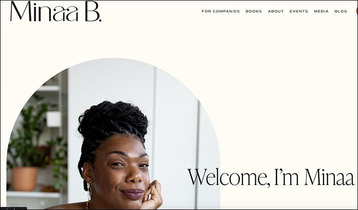
Are you a mental health educator planning to take your practice online to reach a wider audience? Then you should check the Minaa B. website for a few pointers on creating yours.
The layout of this website is simple, without confusing elements. There’s a bit of animation where text rolls from one end to the other, displaying her new book. Something like this will work on your website if you plan to roll out a new service or mental health program because it catches visitors’ attention.
Another inspiring aspect of this website is how the background color has been toned down to reduce the screen glare you’re likely to experience when opening pure white web pages.
Using images is another angle you should emulate, but ensure the images are well-optimized and kept to a minimum to avoid slowing your website.
The About page on this website is beautifully written, capturing Minaa’s life journey to becoming a mental health educator, with everything captured in about four concise paragraphs. Try adding something similar so your potential visitors can know a little about you.
Also Read:
3. Victoria’s Kitchen
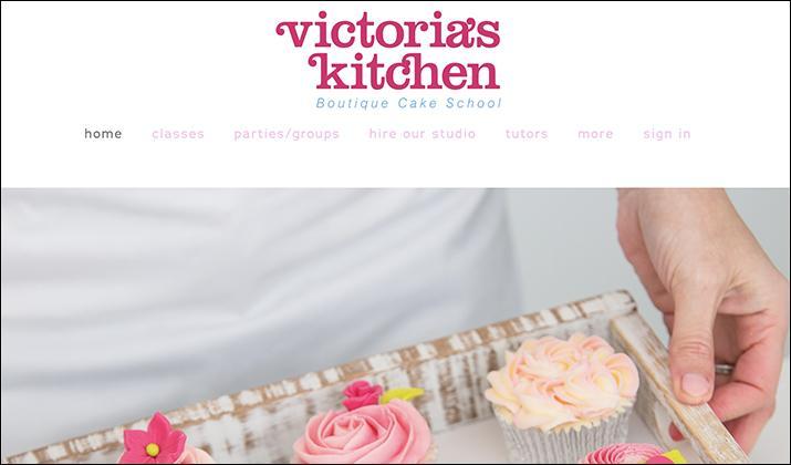
Cooking is becoming an integral part of social life, and if you want to give a cooking website a shot, Victoria’s Kitchen is a good example.
Started and run by Victoria, a lifelong baking hobbyist, this website fits the baking aesthetic well. Cooking websites need pop colors, which is why Victoria’s Kitchen has a dash of bright pink and peach mixed with blue for some of the fonts and purple for the graphics.
But you must be careful when selecting bright colors for your website because it’s easy to end up with shades that may clash.
Another interesting feature I haven’t seen on any other website so far is the availability of a map showing Victoria’s Kitchen’s physical location. You can add this if you have a physical premise to help visitors who may want to drop by know exactly where to find you.
Finally, adding images showcasing baked goods is pivotal for the website’s overall performance if you want to attract business. Clean and colorful images of the food you’re specializing in will add credibility to your website.
Also Read:
4. Caroline Haugsted
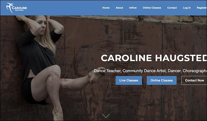
If you are a dance instructor looking for ideas on how to design a website for teaching people how to dance, then what Caroline Haugsted has done with her website could give you ideas.
The first thing that catches your eye on this website is the logo. It’s in the shape of a person in the middle of dancing, followed by the name Caroline. That logo alone informs you what the website is all about. Therefore, try exploring the same path by using a graphical logo related to dancing, then maybe pair it with your name.
Right after the logo, you can see the image of the dancing instructor. That’s important because people tend to trust personal teacher websites that show the owner’s image, preferably doing something related to what they’re teaching.
So snap a picture of yourself striking a familiar dancing pose and use that. There’s also a section about Caroline Haugstad and her journey with dancing and, most importantly, the school she graduated from. That’s the kind of information that sells a website.
Many videos are used on the website too, which is another good way of showcasing your skills.
Explore:
5. Weronika Zubek Fine Art
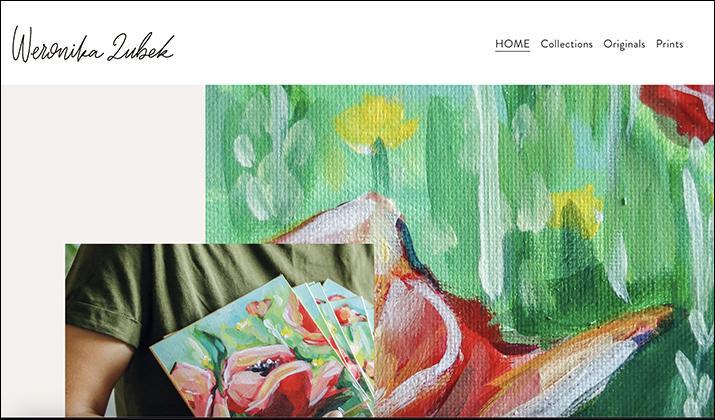
This is one of the most personal websites on this list and a perfect example for talented painters who want an official presence online that showcases their work.
What I love most about this website is how Weronika Zubek has integrated a platform for showcasing her work with an online shop where people can buy paintings directly from her. But that’s not all; there’s even a blog where she writes about her art process, among other things.
These kinds of resources make a website like this perform well with audiences. If this is the path you want to take, take some elements from Weronika, like adding an eCommerce platform if you plan to sell your artwork or adding a section for classes if you intend to teach people how to paint.
As for the website’s appearance, the background colors are a mixture of vibrant and earthy tones, complimenting the many art images displayed on the homepage.
Furthermore, Weronika has embedded YouTube videos of her painting process from scratch. This is not only a source of entertainment for website visitors but a way for her to prove that she can deliver what she promises.
6. Laurent Bouty
Marketing has been the pillar of businesses for ages, and as the internet continues to expand, so are online marketing resources. One of the many websites that stand out regarding the best marketing advice and help you can emulate is Lauren Bouty.
Created by Lauren Bouty himself, this website offers marketing packages for big and small businesses worldwide. You’ll also find informative articles that explore all the latest trends in the marketing world.
Like most websites here, it features the image of Lauren Bouty on the homepage, giving the website a face and making it easy for visitors to relate to. Likewise, get a professional-looking image of yourself and use it for your website.
There’s also an inspiration section curated to help people stuck on finding the way forward for their businesses. You can also add that to your website to provide real-time solutions to help people get out of a business rut.
Lauren Bouty uses simple colors and black and white interspaced with images to deliver his marketing advice. Apply the same principle and only include vital information while saving the fleshy details for the blog section.
Explore:
7. Gil
If web design is your cup of tea and you want to guide people who don’t know where to begin, then you might want to check out Gil’s website for ideas on how to model yours.
Created by Gil Huybrecht, the website has a straightforward, white design with strategically placed text that explains everything right away when you open it.
Gil, a digital designer, has the experience required to offer people the advice they need to create the best business websites that increase client engagement.
The way he only displays essential information that adds value to his visitors is something you need to integrate into yours. Other necessary additions that may also serve you, like Gil, include social media links that direct people to your accounts.
8. Christian Dorn Music
It’s commonplace to find talented musicians branching out into training other people to use instruments, and if this is you, Christian Dorn Music can give you ideas to help you design your website better.
On top of offering recording sessions, drum lessons, and performances, Christian Dorn is a talented music tutor who can turn an amateur into a professional within days. He lists all the instruments he’s good at, and that’s the information you also need to display. Nobody wants their visitors to keep guessing.
Like most other websites, Dorn has added images of himself handling different instruments to give a sneak peek of what he can do, which is suitable for the audience. There’s also a short bio where he describes himself and his experience in the music industry.
The colors aren’t as bold as some options listed here, but they get the job done because the layout is easy to navigate with every section labeled. Dorn has also added a blog and other resources like drum PDFs and guides.
Consider having that, too, depending on the type of musical instrument you want to teach on your website.
Also Read:
9. Angela Valencia
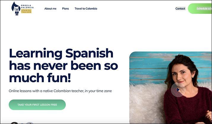
This is the perfect teacher website example for anyone trying to teach people a foreign language online. It’s simple, with huge fonts and a colorful logo that catches your attention when you open the homepage.
Angela Valencia, a Colombian native, started the website some years back to provide an easy avenue for people looking to learn Spanish online without paying too much or attending physical classrooms.
The website features a picture of her and a link to a video of her introducing herself and her work in Spanish. That’s a perfect selling point because it creates confidence in people who come to check out your website; if you can add that, the better.
According to the information on her website, Angela Valencia has taught 178 students over 4,520 hours of lessons. There’s also an option for students to book online classes on top of a detailed guide on how the studies work.
In short, one look at the homepage gives you all the information you need about this website, and that’s what you should strive for.
10. Amanda Lynch
Climate change is a big topic for many people right now. If you’re all about educating people about the environment and sustainability, then the Amanda Lynch website will significantly help you.
Amanda Lynch, a professor of earth, environmental and planetary sciences from Brown University, turned her fascination with the planetary ecosystems and built this website to disseminate educational materials to help people understand the current state of our planet.
The site has an academic design made of plain colors and simple fonts. It houses all the necessary information, like research and scientific groups, that could help people pursue a degree in the same field.
Check Out:
11. Ramsey Voice Studio
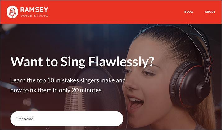
This beautiful voice coaching website is run by Matt Ramsey, a vocal coach and singing teacher. He provides resources for music students who want to take their craft to the next level.
If you’re a music teacher and want to create your website, I recommend borrowing a leaf from Ramsey Voice Studio. For example, using a microphone for the logo is brilliant as it immediately communicates what the website is all about, and that’s what you want for your website.
Using bright colors, like red, is another clever way of grabbing attention, so consider moving in the same direction with bold colors.
Another helpful bit about the website is how easy it is for people to get in touch or subscribe to the services they need. For instance, clients can book sessions online and, at the same time, access a very detailed blog that explores everything about music and voice training.
You should also consider adding a very detailed About Me page like the one on Ramsey Voice Studio, where you list your qualifications, experience, and what you offer. This is important because users want to know immediately that they’re dealing with a professional.
Explore:
12. Ken Duncan Mah
This is the platform you should be looking at for tutors who deal with UI/UX design and would like to create their website.
The first thing that stands out about this website is how Ken Duncan combined bold colors like bright red with animated elements in the background. Using different kinds of bold fonts is another feature common with UI/UX designers, and that’s what you should aim for.
The website also lists all the services Ken Duncan provides, and you should emulate that, too, to ensure people get all the information they need immediately. Adding your contact information is essential, too, just in case people want to get more details about your services.
But overall, UI/UX websites shouldn’t be too cluttered with too many details. So don’t overdo it with text and balance things with some visual graphics, as they’re better at showcasing your skills.
Explore: Best Kajabi Website Examples
13. Kim Strobel
The list would be incomplete without one website that deals with motivational speakers. While there’s a lot of skepticism towards this profession, you’ll be surprised at how many people benefit from having a mentor show them the right path.
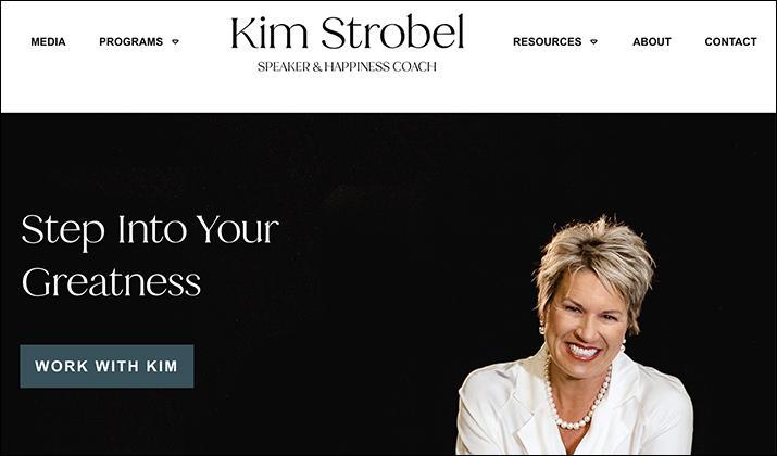
Kim Strobel is a self-proclaimed motivational speaker, happiness coach, and real talk truth-teller, and this website is an excellent example of how an inspirational web page should look like.
If you have plans to inspire people to be better versions of themselves, try emulating this website’s overall outlook. As you can see, there’s very little use of eccentric and bold colors. Instead, Kim has opted for calming earthly tones like jungle green.
The website also has a straightforward setup with a string of navigation buttons near the top, followed by a simple image showcasing Kim Strobel and a short description of what she offers, her qualifications, and her work.
In the same way, provide your audience with similar information and ensure the image you take shows you with a bright smile. You can’t inspire people with a sad face.
You can also add images of yourself in action, maybe on stage, delivering a speech, or just interacting with your audience.
Also Read: Sharepoint Intranet Website Examples
Wrapping Up
There you go. Some of the best teacher website examples.
If you ask me, I like JP Teaches Photo. It’s not too busy, uses neutral colors, and it displays all the information you need on its homepage.
That said, all of them are good and have their own positive points. Pick the one you like and start building your website today!
Tom loves to write on technology, e-commerce & internet marketing.
Tom has been a full-time internet marketer for two decades now, earning millions of dollars while living life on his own terms. Along the way, he’s also coached thousands of other people to success.

